Chapter 1
Using a Spreadsheet to Plot Curved Shapes - Part B
This continuation explains the steps required to plot from the data table that was
calculated in Part A.
That table is reproduced next for your review.
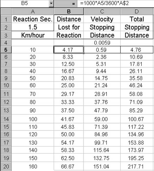
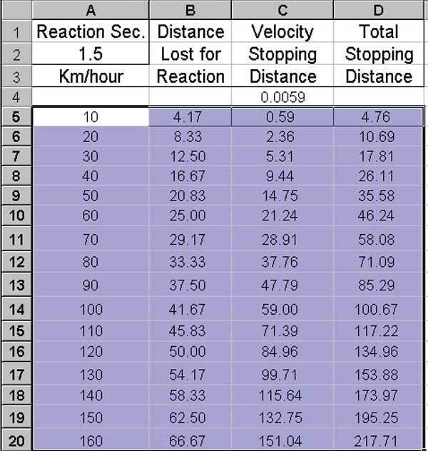
Now, use the mouse to select cells A5:D20 as is seen next.
Choose the
Insert menu and from it select
Chart: this
will bring out step1 of the
Chart Wizard seen next.
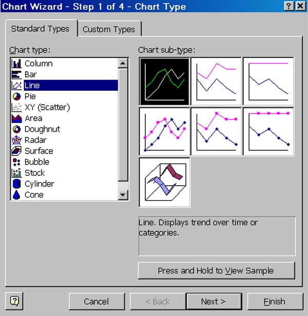
On the Wizard, select
Line and
Chart sub-type
as shown and then
Next>. This brings up Step 2
of the Wizard as seen below.
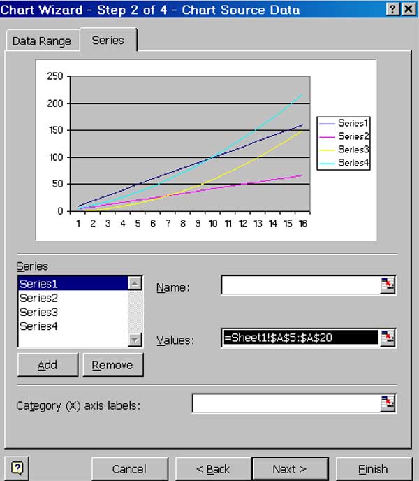
On this form, to apply the labels that are shown above as S
eries1,
to the x-axis, use your mouse to select the expression shown at
Values: and copy it to
Category (X) axis labels:,
then click
Remove
to delete Series1
as a series to be plotted and
then
choose
Next>.
Step 3 of the Wizard will then appear.
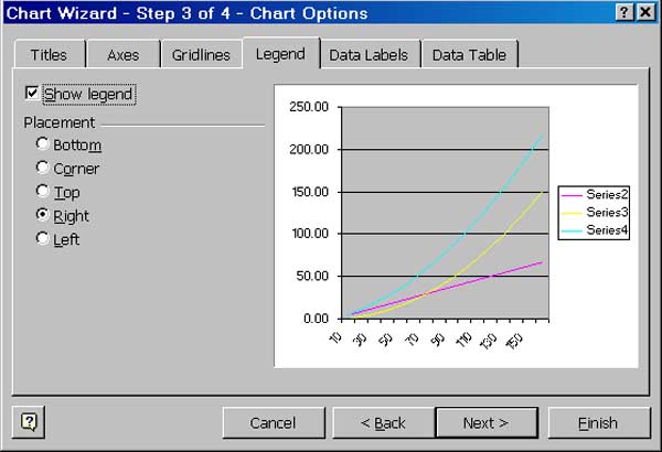
The thumbnail in step 3 above now shows labels on the x-axis.
For our example we are going to create our own
Legend,
Titles,
and
Axes notation; therefore just deselect
Show legend
and choose
Next> to proceed to
Step4.
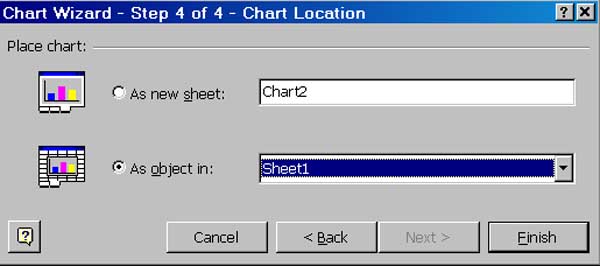
Here we select
As object in:
and then select
Finish.
The chart then appears on our sheet where it can be positioned and sized as desired.
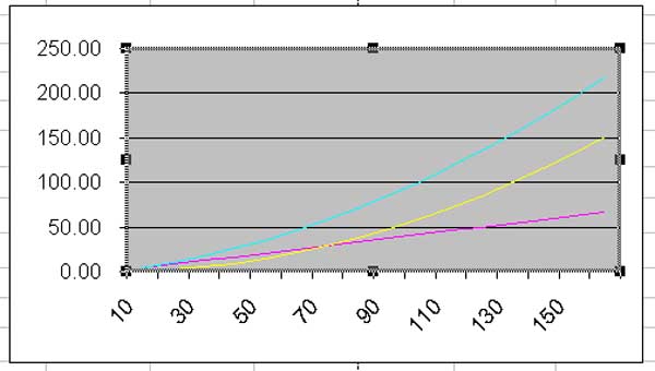
Excel has made default choices for the background color of the plot area, the size
of the plot area, the colors for the three plots, the axes scales and their notation.
The width of the plot area should be reduced to make room for our own version of
a legend. This is done by clicking on the central small black rectangle at
its right and dragging it some to the left.
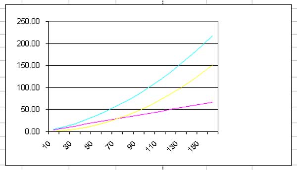
As a white plot area would increase the contrast, left click on that area to see
a small menu. From it choose
Format Plot Area to bring in a form
that allows you to
choose the plot background colour.
The result of the forgoing two modifications is shown next.
To begin our custom legend, click inside the chart area and then click on the
sheet's
Edit line to type there "Stopping Distance
" and
then press the Enter key. The text shows up on your chart as an object, a TextBox, that
can be moved, sized, text edited and font edited.
Next, choose custom colors for the three plots, red for the stopping distance, blue
for the speed component and black for the reaction time component. This done
by clicking a plot to select it and then clicking the sheet's
Format
menu and there selecting
Selected
DataSeries. A form will then appear that allows selection of
line colour and line weight.
It remains to set the notation for the axes. As this was explained in Part
1 of this topic, no further explanation is needed here. See the final chart
with its table next.
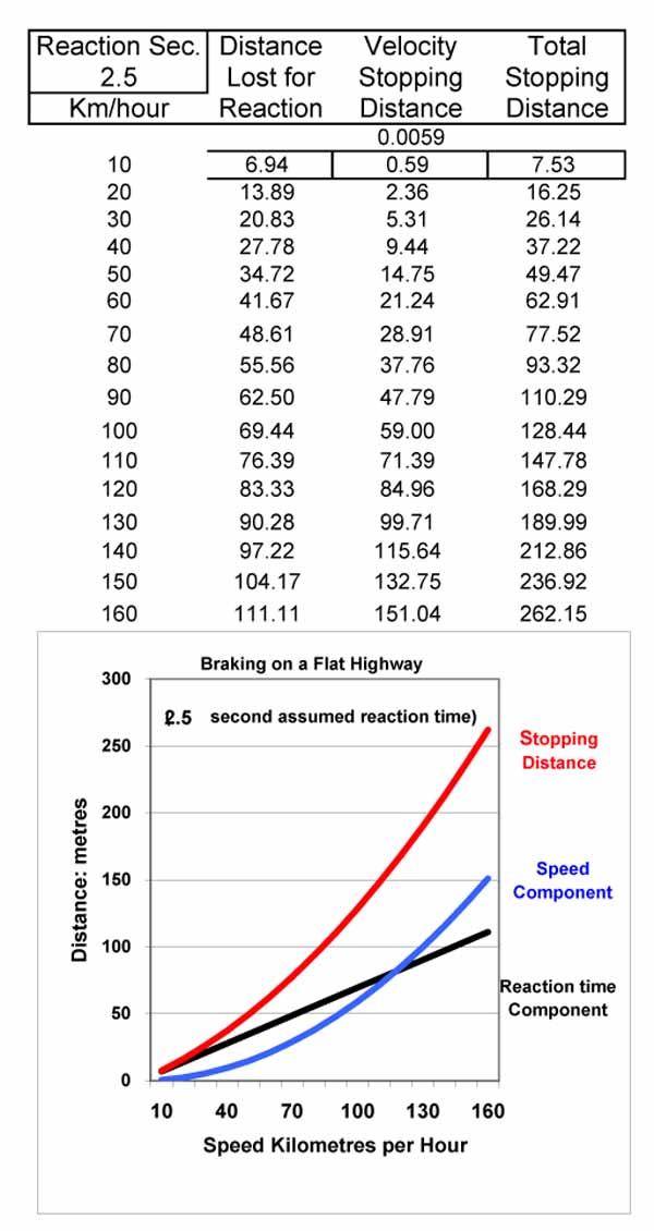
For this plot the reaction time was changed from its nominal 1.5 seconds, in cell
A2, to 2.5
seconds. Without further user intervention, the table and plot automatically
change to that seen in the forgoing.
Next
The Theorem of Pythagoras is used to introduce Sines and Cosines and some identities
of trigonometry.